Assistant professor in informatics, information architect, designer, piano player, author.
Mobile shopping is not the answer (I)
Grocery shopping normally tops the list of what everyone would love to see improve once big time issues such as governance, healthcare, education, world peace and hunger are taken care of. This is far from unexpected: shopping for groceries is something we can all relate to, and the supermarket is a common experience for most of us. It just seems that improving what we have is a harder nut to crack, especially if we just focus on technology as we often do.

If you ask “how can we improve shopping?”, nine out of ten times the answer will be “mobile!”. More specifically, it will probably be “an app!”. If you are an app designer or developer, that makes sense. But if you are a supermarket? Or, god forbid, a customer? I’m not sure.
If you are a supermarket, it seems counterintuitive to address a systemic issue with a local solution that mostly replicates what your website already does. If you are a customer, installing app after app on your phone, one for each grocery store you might happen to visit more or less regularly, all asking for your personal data first, all competing for your attention and loyalty, should provide larger benefits than having to learn how to use them, maintain and update them. These benefits are rarely there, and the reason for that is that answering “an app!” moves the focus back to an artifact, as good as it might be, and away from structuring the public information architecture of the supermarket that should be supporting it. What makes Amazon a great shopping place is not their buttons or their choice of fonts, but the way they use and handle the information they have across the different channels that make up their platform.
Supermarkets have been deploying multi-channel strategies for decades, sending offer-of-the-week brochures in the mail, advertising in newspaper and tv, and more recently moving into Web space or app space. But supermarkets are also traditionally the playfield of expertise other than that of information architects, user experience designers, or interaction designers: while a holistic vision of shopping as an encompassing experience beginning way before customers enter the store has slowly started to become mainstream, mostly thanks to the increased penetration of personal mobile devices, digital has been employed cautiously at the most, and mostly for the benefit of the supermarket, not of the customer’s. Add, yes. Profit from it, maybe. Rely on it for better service, not so much.
Can it really then be a surprise that a fully formed customer-facing digital / physical strategy that exploits in full the global information architecture of the supermarket for an improved shopping experience is still very often an undeveloped secondary thought? Can it really be a surprise that we drown in apps, but we can’t quickly and easily figure out how much we would spend for our current shopping list unless we are at the store?
Plenty of tactics, little strategy.
Still, talking shopping is talking big systems. We know that shopping never entirely coincides with simply buying products: it is not just picking up something from a store (or a website) and paying for it. There is plenty going on before and after that, and a lot of it has to do with information produced, received, shared.
Immersed in a constant stream of news, facts and factoids, our behavior and choices are the complex product of the interactions between slow layers (how we were brought up, our culture, our family traditions), relatively fast layers (our economic situation, special offers coming in our mail, advertising, previous experiences with a certain product, societal pushes for healthier or more socially conscious eating), and even faster ones (a suggestion from a friend, the latest meme on social media, a last-minute text message while on the way, the sudden craving for chocolate). We go through this process mostly unaware, mixing sources, channels, devices, and contexts at will.
In this postdigital conundrum, how does the supermarket communicate with us? If you allow me a little simplification and generalization, we can identify five main channels:
print, including all communication that comes in paper format. Promotional leaflets, brochures, ads;
store, including everything which has to do with the physical stores themselves. Location, shop layout, parking spaces, signage, way-finding, shelving, positioning;
social, including interactions with staff, word-of-mouth advice from others, and social media, either supermarket- or crowd-owned;
web, including Web browsing, mail, the download of software updates, but excluding anything specific to mobile;
mobile, meaning all communication happening in-context through mobile devices via specific applications or systems.
Traditionally, these are used as mostly noncommunicant silos. They do not contradict each other, but they rarely collaborate beyond being polite.
Besides these five, we need to consider the environment within which both customers and the supermarket interact. The environment allows for system-level transactions and interactions to happen: it includes everything from language to social conventions, currency, and a way to physically access the supermarket (ie, public roads).
Now meet Maria. She spent a week-end in London with friends, and now she’s just back. It’s Sunday evening, the fridge is almost empty, and she needs some food for the week. All major chains send advertising in the mail on Fridays and Saturdays, so she has a good deal of paper to shift through. She finds a couple of special offers at one of her go-to supermarkets, and she adds them to a list of necessary provisions she is scribbling on a scrap of paper. She then logs in to the supermarket app on her tablet. There’s no interesting sale-of-the-week coming up, so she goes to bed. On the Monday, she drives to the store on her lunch break: she finds a parking place, fetches a cart, enters the store. Here she uses her loyalty card (she has signed up for loyalty cards at all of the local supermarkets she visits regularly) to unlock one of the in-store readers so she can self-scan products and avoid queues, and she starts to shop.
This is an almost automatic process, as she knows the place and knows where to find what’s she looking for. She asks someone from staff about a couple of items which seem to be out of stock, but they have simply been moved. When she is through with her list plus a couple of impulse purchases, she goes through the self-scan cashier lane, pays, and she is out. Her break is almost over: she stoves all her bags into the car, and she is off to work.
Maria here went through a number of very distinct steps most of us also go through week in and week out, all of them important for our final shopping user experience, and all of them presenting relevant information-based aspects:
getting information about current products and offers;
building a shopping list;
driving to the supermarket;
parking;
fetching a cart;
navigating the shop;
finding products;
queuing and paying.
If we consider shopping as our process, the steps above can be considered macro user activities: we could break them down into finer and more specialized tasks, but we want to keep it simple. And we could of course walk or bike to the store, or use public transport, but not much would change overall, except that in the case of public transport we would need even more information: what buses to take, where are the bus stops, what time do the buses run, and so on.
In the traditional, old-style supermarket, all tasks except possibly (1) above would be tied to one single channel, that of the brick and mortar store and its physical layout. In our little story here the supermarket might not be particularly cutting edge but it gets to be more pervasive than that. Maria read the special offers in her mail (paper) and wrote down a shopping list: this is something many of us usually do. She then used her loyalty account with the supermarket and an app on her smartphone to double check and see if there was any specific offer (mobile); she self-scanned her products (store); she paid with a credit card (environment). She also needs to find a parking place, navigate the shop (store), and interact with staff (social). Finally, consider that unpacking and using the products is actually an important part of the shopping experience: Maria is not going to be happy if the meat is stringy or if the yogurt is watery.
All of these are cross-channel activities (Maria moves between channels at will) not only do influence the final user experience: they ultimately constitute what it means to shop in that specific supermarket. Not a simple mathematical sum of all of the micro- or macro-experiences that characterize each single task, but an open, complex, dynamic system that is preciously personal and different for each customer.
Some solutions seem easy because we have technological solutions that are ready to go: these are usually the wrong answers. Maria wrote down a shopping list on a piece of paper. Many supermarkets have introduced shopping lists in their apps. These are certainly used, and sometimes useful, but they offer little improvement over post-it notes and a whole lot of new constraints. Sharing these, for example within the members of a family, can become problematic. Generic to-do apps such as Evernote or Remember the Milk allow sharing, but they know nothing about the specific supermarket we are visiting, their stock situations and products, and that should be one of the pluses we get from loosing the readily availability of paper.
The questions on the table ha
ve
changed little since me and Luca Rosati wrote the original case from which the example
of Maria
here is derived for “Pervasive Information Architecture”: while mobile is certainly
a larger part of the process
today than it was in 2010, we
are still trying to figure out how we
could improve this
experience in general
.
Not for a single chain, not for a single customer, but for shopping in general. H
ow much of this could
we
ma
ke
better
by using what is already available? How much of this could we rethink to find new ways to improve
the process radically
?
In the book, we highlighted how five general, channel-aspecific heuristics could be used to drive the design process. Today, I’d probably add how this is not about making mobile the center of everything: it is about structuring a consistent and stable information architecture that works across the different channels of this specific ecosystem and that supports Maria and all of us in our personal trajectories across the physical and digital palimpsest of the supermarket. I’ll explore some of this next time.
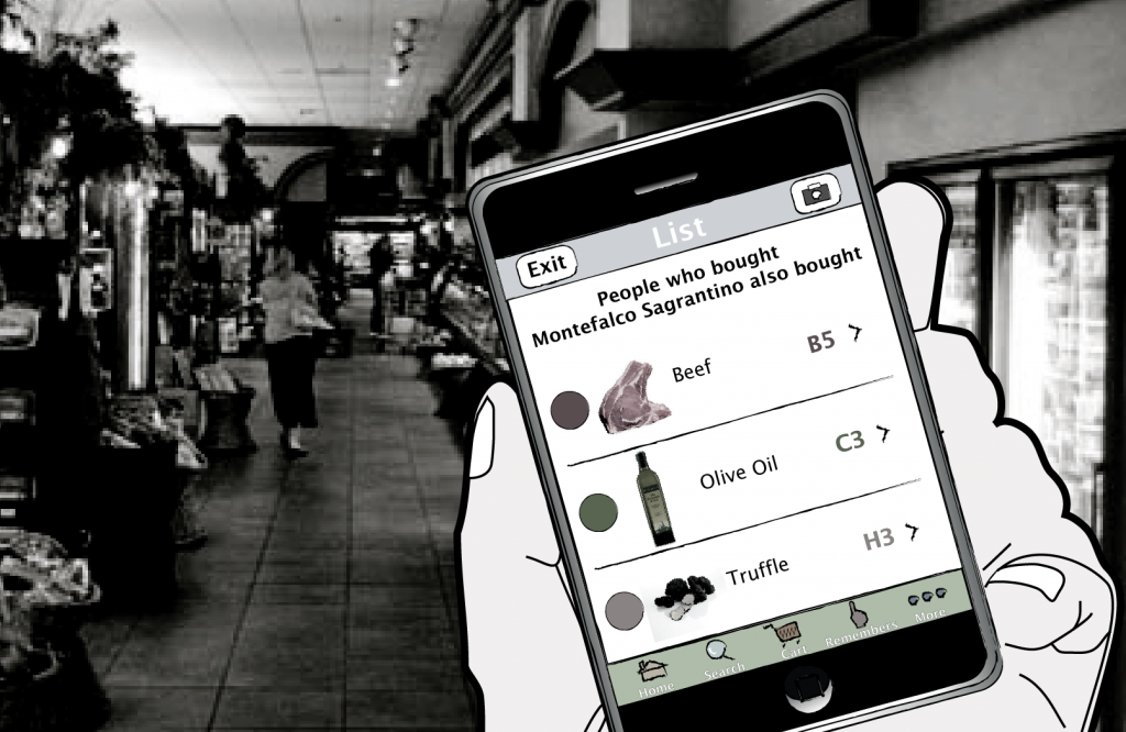
(Cover image: A. Falcinelli, for ”Pervasive Information Architecture” – 2011, Morgan Kaufmann)
Detta är en bloggtext. Det är skribenten som står för åsikterna som förs fram i texten, inte Jönköping University.


